
Transforming a Leading Financial Education Platform into a Unified Digital Experience
7800+
Registrations Generated
1 Unified
Digital Ecosystem
100%
Redesigned User Journey
Improved
Content Discoverability
The Brand
Our client is one of India's leading financial education and professional development platforms, serving thousands of financial advisors through educational programs, certifications, events, and community initiatives.
As the organization expanded over the years, its digital presence evolved across multiple websites and independent platforms. While each platform served a specific purpose, the fragmented ecosystem created inconsistencies in user experience, navigation, and registration journeys.
The objective was not to rebuild the business but to rethink how users experienced it digitally by bringing everything together into one seamless, scalable ecosystem.
Industry
- Financial Education
- Professional Development
- Learning Platform
- Community & Events
- Digital Education
Services Provided
- Website Strategy & Restructuring
- UX Research
- UI/UX Design
- Information Architecture
- User Journey Optimization
- Conversion Optimization
- Responsive Website Design
- Growth-Focused Digital Transformation
Location
India
THE CHALLENGE
As the platform continued to grow, its digital ecosystem became increasingly fragmented. Users often navigated across multiple websites and disconnected digital touchpoints before completing a registration or accessing learning resources.
Several conversion barriers were limiting growth:
- Multiple websites with disconnected user experiences
- Inconsistent navigation across platforms
- Complicated registration journeys
- Low discoverability of educational content
- Fragmented community and learning experiences
- Inefficient conversion funnels
- Lack of a scalable digital architecture for future expansion
OUR APPROACH
Rather than creating additional digital assets, we focused on simplifying the entire ecosystem.
Our approach centered around designing one connected experience where users could seamlessly discover programs, access learning resources, register for events, and engage with the community.
01
Consolidating multiple digital properties into one unified experience
02
Redesigning navigation for effortless discovery
03
Creating intuitive registration flows with reduced friction
04
Restructuring information architecture for improved accessibility
05
Designing a consistent visual and interaction system
06
Building a scalable foundation capable of supporting future growth
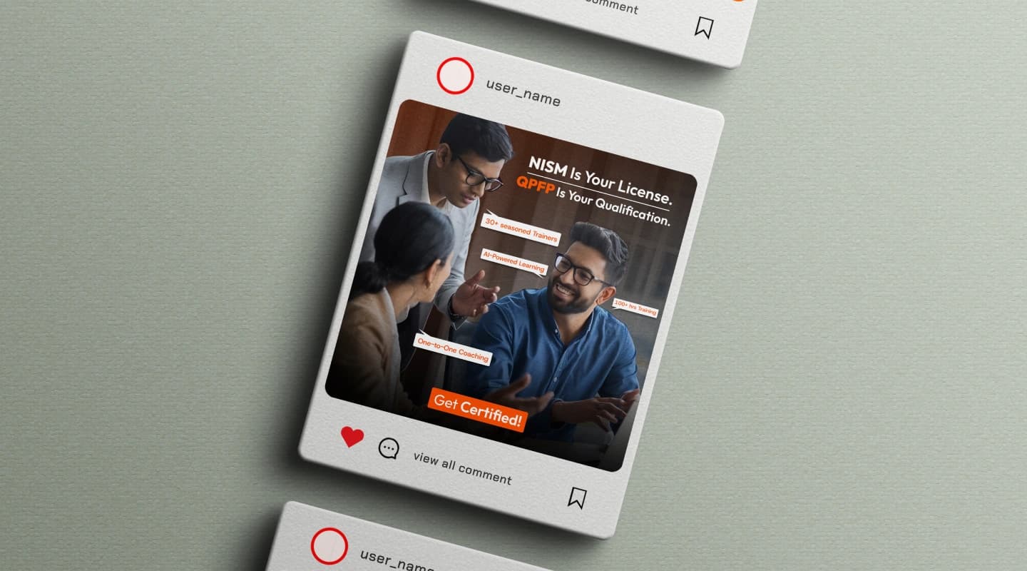
Information Architecture
A strong information architecture became the foundation of the project.
We reorganized content into a clear hierarchy, allowing users to quickly discover educational programs, certifications, events, blogs, community resources, and registration pathways without unnecessary complexity.
The new structure reduced navigation depth, improved content discoverability, and created a consistent experience across the entire ecosystem.
- Clear navigation
- Session-first experiences
- Minimal cognitive load
- Scalable admin workflows
- Consistent visual language
- Fitzy was structured as a multi-role digital ecosystem designed to serve three different user groups — members, trainers, and administrators — each with unique goals, behaviors, and workflows.
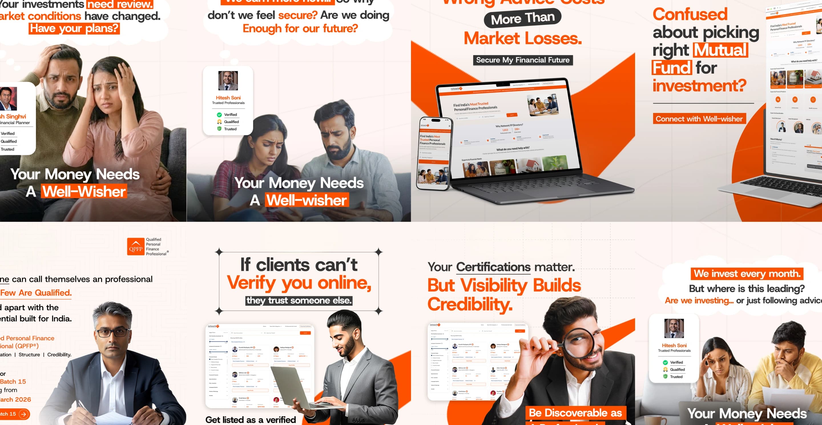
Moodboard
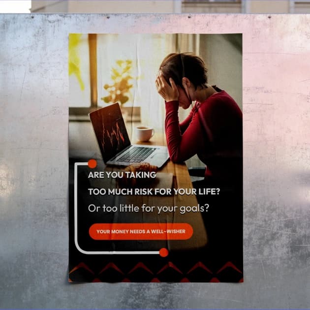
The visual direction focused on building trust, professionalism, and clarity while maintaining a modern digital experience.
The design language emphasized:
- Clean and structured layouts
- Professional typography
- Minimal yet engaging interfaces
- High accessibility
- Consistent spacing and visual hierarchy
- Conversion-focused UI components
- Responsive design patterns
- A scalable design system
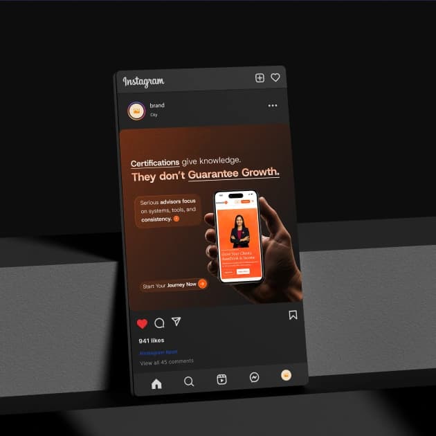
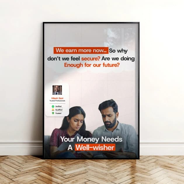

Visuals
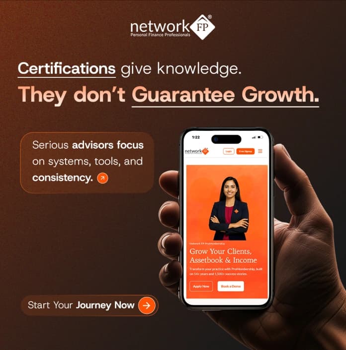
Every screen was designed to guide users naturally toward learning, engagement, and registration.
The interface prioritizes clarity, intuitive navigation, and seamless interactions while ensuring consistency across the entire platform.
The experience includes:
- Homepage Experience
- Learning & Certification Pages
- Registration Flow
- Event Pages
- Community Experience
- Resource Library
- Responsive Mobile Experience
- Design System Components


Final Outcome
The redesigned platform successfully transformed a fragmented digital presence into one unified ecosystem that supports education, engagement, and long-term growth.
Impact
01
787,000+
Registrations achieved through the transformed digital ecosystem.
02
Unified Digital Experience
Multiple websites consolidated into one seamless platform.
03
Improved User Journey
Simplified navigation and streamlined registration experience.
04
Higher Engagement
Better content discoverability and increased platform interaction.
05
Scalable Foundation
A future-ready digital ecosystem designed to support continuous expansion.
This project demonstrates how thoughtful UX strategy, information architecture, and digital consolidation can unlock significant business growth without changing the organization's core offering.
By focusing on user needs instead of simply adding more digital assets, we created a connected experience that improved engagement, simplified complex journeys, and established a scalable foundation capable of supporting hundreds of thousands of registrations.